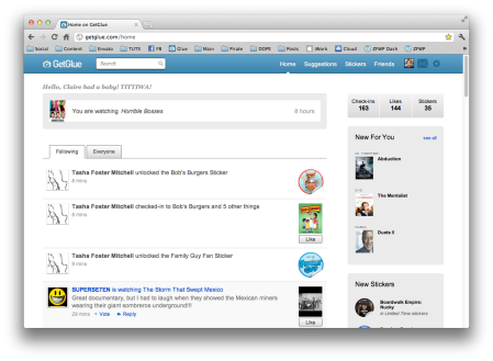
GetGlue, the “activity-check-in website” similar to but more popular than, Miso—has come out with a new iPhone app. They have polished the interface just a little. Quickly I came to thinking, they need to do the same to their webpage. Their iOS GUI makes their web-app look like it was run over by Web 2.0.
New graphical features include:
- Polished main page
- New conversation view with iChat-like bubbles
- New “checked-in” page with more content; more options
- Smaller fonts on the check-in history page
- Within conversation, a pop-up for “Agree-Cool-Funny-Reply”
The iPhone App
In the photo, you can see they’ve polished the check in buttons to give them more of a unified, chunky, trendy feel. They also finally fit all of the buttons on the same page. In my opinion, having to scroll to view more buttons (when all there is, is buttons) on the main page of any full screen application, is a major design flaw. No one wants to attempt to push a button, and then have to slide a finger down just for one more option. You should either scroll for more options, or have them shrunk! Tip for good design.
Everyone is and should be going with the iOS-native chat bubbles. Although some, hence the GetGlue app, use their own colors. Good idea, but sometimes they do a little more and create them from scratch, and make them almost look foolish. They didn’t do so well on the padding of the text; they could have touched that up a little bit more. But it’s alright, it still looks good enough. The plus icon bring up the pop-up with the interactive ‘Agree, Cool, Funny, Reply’ options.
This is the most innovative part of the design yet. The interaction buttons. A fantastic use of color blending and small gradients on the box surrounding the buttons. Not that GetGlue gives us much to work with, but when it comes to keeping it simple, they nailed it. I’m just getting used to the “Like” functionality being built into every website I see. Now I have to deal with Funny, Cool, and Agree. Fantastic.
Checked-in! The new page that comes up after you’ve just checked into an activity, got a big revamp. It no longer gives you simple information you’ve already read along with a confirmation. Gives you all of them information the web-app gives you, plus you can scroll down for more options. It’s quite colorful, so you notice it rather than skip right through it. A reason to keep the app open and continue browsing before close the app.
These are the main things I wanted to point out for the iPhone app with one more thing.. When you go to “Profile” or “Messages” or any link to an app feature like those, you know the usual “Back” button on the top left to get back to the previous page. Well it says “Messages” or “Profile.” That is the only place in the app that constitutes anything but “Back” as the title for that button. They should be using more specific buttons in some places so you know where you’re going. Sure, its obvious to most, but you’d be surprised when sometimes you run into a time where you would like to know before you go back.
The Web App
You can see immediately that the web-app is lacking the fantastic interface polish that came with the iPhone version. The app actually—since the beginning—hasn’t taken any hints from the web-app. Thais a good thing in this case. Most brands nowadays go to great lengths to polish both before launch.
The web version has a great interface, and all pages are unified—but its surely not unified with its iOS apps. (Brands have much more freedom on an iPad, so those apps are usually; hopefully much better) If they simply took their own advice on the web-side of things, they would have an amazing app experience.
Overall: I brought this up from personal experience. I was using the web-app and realized how much I wanted to take the iPhone version for a spin instead, even though my iPhone was in the other room. I like being able to have a tab next to Google+ and Facebook—for GetGlue—so I can jump right to it seeing as i watch 3/4 of my media on my iMac.
Readers: Which do you like better? (Web or iOS versions) You think the web version needs some work? Did GetGlue do a good enough polish on their iPhone app?


Pingback: GetGlue's New iPhone App Is Nice; Their Website, Not So Much … | mangotree.co.cc
Hey thanks for posting, Good Stuff!!.
No problem man! Subscribe and I will keep it all coming!